• Home
  • Latest
  • Fortune 500
  • Finance
  • Tech
  • Leadership
  • Lifestyle
  • Rankings
  • Multimedia
HealthCoronavirus

The U.S. is in a sixth COVID wave—but it doesn’t look like it on a new CDC map

By
Erin Prater
Erin Prater
Down Arrow Button Icon
By
Erin Prater
Erin Prater
Down Arrow Button Icon
May 22, 2022, 5:00 AM ET

The U.S. Centers for Disease Control’s color-coded map of COVID “community levels” shows most of the U.S. covered in a soothing shade of light green, symbolizing “low” transmission levels, as of May 19.

But another CDC map showing “community transmission” as of May 19 shows most of the country enveloped in red, symbolizing “high” transmission.

Which is reality when it comes to the state of COVID in the U.S.—a safe, soothing sea of teal, or a perilous, fiery ruby inferno?

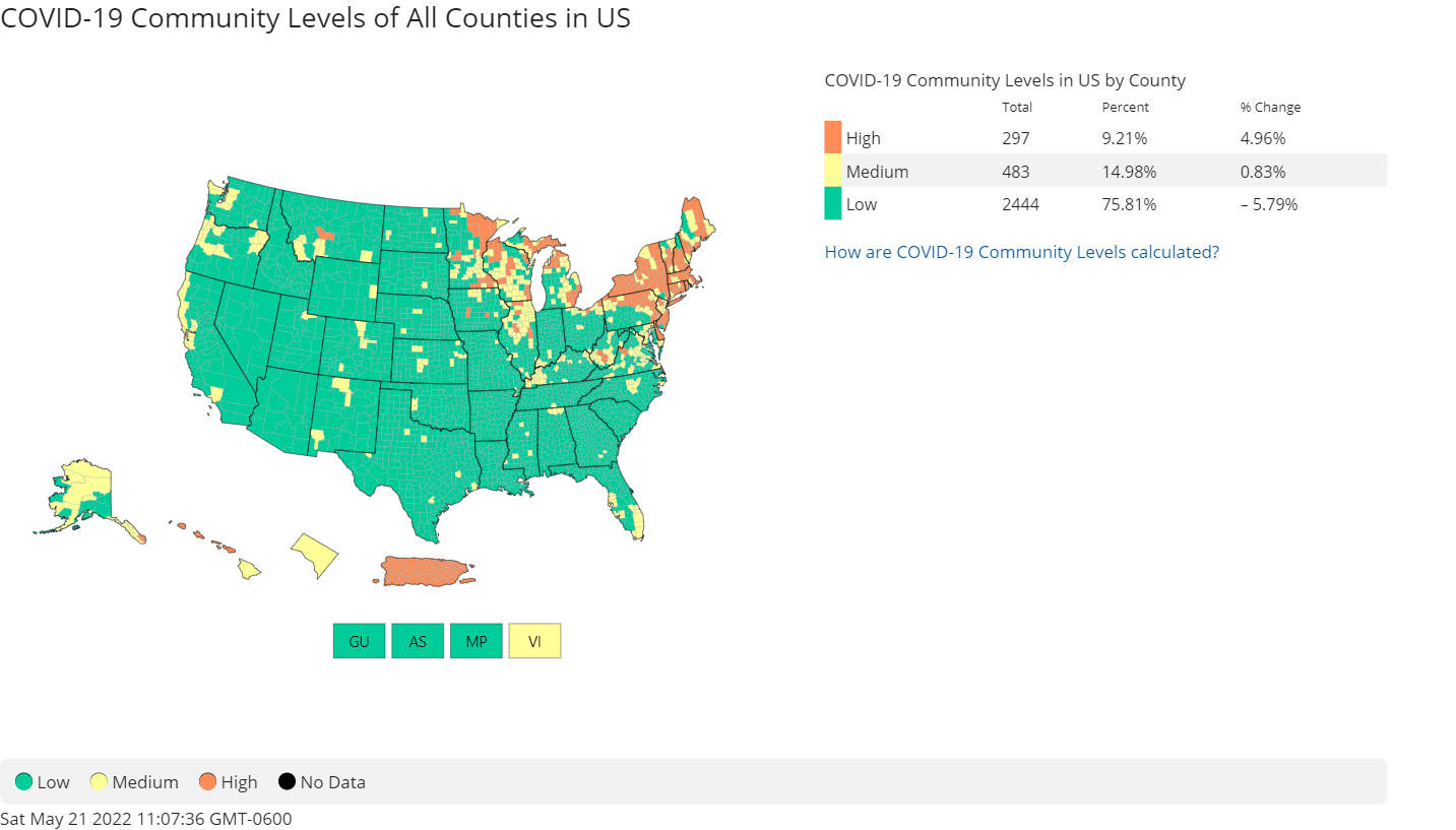
“This should make you angry,” Dr. Jonathan Reiner—a professor of medicine and surgery at the George Washington University School of Medicine and Health Sciences, and CNN medical analyst—tweeted last week, citing a CDC tweet featuring the cool-color map of “community levels.”

“The U.S. is in the midst of a real COVID surge … yet the @CDCgov tweets this,” he said. “Nothing to see here. All is well. Everything is green.”

This should make you angry. The US is in the midst of a real COVID surge with more than 100k reported cases (?500k actual cases) per day yet the @CDCgov tweets this. Nothing to see here. All is well. Everything is green. https://t.co/pPg9iPZS4g

— Jonathan Reiner (@JReinerMD) May 14, 2022

He also referred to the discrepancy as “gaslighting,” adding, “Tell me why I’m wrong about this.”

2 nights ago I told @donlemon that CDC has been “gaslighting” the United States. Tell me why I’m wrong about this. https://t.co/UxjuolEInn

— Jonathan Reiner (@JReinerMD) May 13, 2022

The debate has set the Twitterverse ablaze, with one Twitter user sharing a before/after meme of a cartoon dog roasting in yellow flames, then (presumably) relaxing in green flames—a dig at the CDC’s new color scheme.

new meme for the CDC’s COVID-19 maps
h/t @todd8585https://t.co/MD2nmv3F8Vpic.twitter.com/fGKxo4kO1s

— Nurit Baytch  (@NuritBaytch) May 14, 2022

Another individual tweeted, “Today I learned that the Walgreens COVID map is more helpful than the CDC’s.”

Today I learned that the Walgreens covid map is more helpful than the CDC's pic.twitter.com/mhdjT2hbUS

— Read Let This Radicalize You (@JoshuaPHilll) April 16, 2022

The U.S. is experiencing a sixth wave of COVID, with over 90,000 confirmed new cases a day and a 20% increase in hospitalizations over the past two weeks. The actual number of new cases per day likely sits at a half million or more, “far greater than any of the U.S. prior waves, except Omicron,” writes Dr. Eric Topol, the executive vice president of Scripps Research and a professor of molecular medicine, in a recent blog post on the maps.

“Meanwhile, the CDC propagates delusional thinking that community levels are very low while the real and important data convey that transmission is very high throughout most of the country. Not only does this further beget cases by instilling false confidence, but it is conveniently feeding the myth that the pandemic is over—precisely what everyone wants to believe.”

What changed?

Things weren’t always this way when it came to the CDC’s visually represented data. Millions of Americans “were instantly transported to a green zone in late February, when the agency unveiled its new metrics and map,” NPR recently reported.

The public health agency didn’t merely swap color palettes on its community levels map—it swapped data sets. Under its new guidance, now based on hospital capacity, anyone living in a green or yellow county can leave their masks at home when stepping out. Prior to February, however, community levels were based on the amount of virus spread and the percent of COVID tests returning positive, according to NPR.

The U.S. Centers for Disease Control didn’t respond to Fortune’s request for comment on the map Saturday, including questions about why the data behind the map, and the colors of it, had changed, and the potential implications for public health.

The CDC switched the map’s data source “to a lagging indicator and completely rescaled the colors to make the map very difficult for the public to use, in terms of actually gauging their risk,” said Arijit Chakravarty, a COVID researcher and CEO of Fractal Therapeutics.

“Functionally, the new map is basically only telling me it looks like there’s still room in the hospitals,” he said.

Some, like Chakravarty and Stanford professor Josh Salmon, are worried about the impact the CDC’s revised guidance could have on adverse outcomes like Long COVID and death, as individuals might not be advised to mask until it’s too late.

According to Salmon, states that fall under the CDC’s category of “high”—the level at which the agency finally recommends masking indoors—seem to experience around 1,000 or more COVID deaths a day.

“By the time the indicator flashes, it’s too late to prevent most of those,” he tweeted in March. “… As a level of mortality the White House and CDC are willing to accept before calling for more public health protection, this is heartbreaking.”

1/ There's been much discussion on new CDC “COVID-19 community levels," anchored largely on predicted deaths.
How high will expected mortality reach before CDC recommends more prevention? Not specified, so @ambilinski and I decided to work it out.
Our inference: >1000 deaths/day.

— Joshua Salomon @jsalomon.bsky.social (@SalomonJA) March 1, 2022

“It would be great, if you are normalizing a different death toll, to be transparent about that,” Chakravarty said. “If we have suddenly decided that hundreds of thousands of death a year from COVID is business as usual, I don’t know if the public got the memo.”

Sign up for the Fortune Features email list so you don’t miss our biggest features, exclusive interviews, and investigations.
About the Author
By Erin Prater
See full bioRight Arrow Button Icon

Latest in Health

HealthAffordable Care Act (ACA)
A Wisconsin couple was paying $2 a month for an ACA health plan. But as subsidies expire, it’s soaring to $1,600, forcing them to downgrade
By Ali Swenson and The Associated PressDecember 13, 2025
4 hours ago
Julian Braithwaite is the Director General of the International Alliance for Responsible Drinking
CommentaryProductivity
Gen Z is drinking 20% less than Millennials. Productivity is rising. Coincidence? Not quite
By Julian BraithwaiteDecember 13, 2025
6 hours ago
Nicholas Thompson
C-SuiteBook Excerpt
I took over one of the most prestigious media firms while training for an ultramarathon. Here’s what I learned becoming CEO of The Atlantic
By Nicholas ThompsonDecember 13, 2025
8 hours ago
Healthmeal delivery
Factor Meals Review 2025: Tester Approved
By Christina SnyderDecember 12, 2025
22 hours ago
Donald Trump
HealthHealth Insurance
‘Tragedy in the making’: Top healthcare exec on why insurance will spike to subsidize a tax cut to millionaires and billionaires
By Nick LichtenbergDecember 12, 2025
23 hours ago
HelloFresh meal delivery service.
Healthmeal delivery
HelloFresh Review : We Tasted Everything so You Don’t Have To
By Christina SnyderDecember 12, 2025
1 day ago

Most Popular

placeholder alt text
Economy
Tariffs are taxes and they were used to finance the federal government until the 1913 income tax. A top economist breaks it down
By Kent JonesDecember 12, 2025
1 day ago
placeholder alt text
Success
Apple cofounder Ronald Wayne sold his 10% stake for $800 in 1976—today it’d be worth up to $400 billion
By Preston ForeDecember 12, 2025
1 day ago
placeholder alt text
Success
40% of Stanford undergrads receive disability accommodations—but it’s become a college-wide phenomenon as Gen Z try to succeed in the current climate
By Preston ForeDecember 12, 2025
1 day ago
placeholder alt text
Economy
The Fed just ‘Trump-proofed’ itself with a unanimous move to preempt a potential leadership shake-up
By Jason MaDecember 12, 2025
22 hours ago
placeholder alt text
Economy
For the first time since Trump’s tariff rollout, import tax revenue has fallen, threatening his lofty plans to slash the $38 trillion national debt
By Sasha RogelbergDecember 12, 2025
24 hours ago
placeholder alt text
Success
Apple CEO Tim Cook out-earns the average American’s salary in just 7 hours—to put that into context, he could buy a new $439,000 home in just 2 days
By Emma BurleighDecember 12, 2025
1 day ago
Rankings
  • 100 Best Companies
  • Fortune 500
  • Global 500
  • Fortune 500 Europe
  • Most Powerful Women
  • Future 50
  • World’s Most Admired Companies
  • See All Rankings
Sections
  • Finance
  • Leadership
  • Success
  • Tech
  • Asia
  • Europe
  • Environment
  • Fortune Crypto
  • Health
  • Retail
  • Lifestyle
  • Politics
  • Newsletters
  • Magazine
  • Features
  • Commentary
  • Mpw
  • CEO Initiative
  • Conferences
  • Personal Finance
  • Education
Customer Support
  • Frequently Asked Questions
  • Customer Service Portal
  • Privacy Policy
  • Terms Of Use
  • Single Issues For Purchase
  • International Print
Commercial Services
  • Advertising
  • Fortune Brand Studio
  • Fortune Analytics
  • Fortune Conferences
  • Business Development
About Us
  • About Us
  • Editorial Calendar
  • Press Center
  • Work At Fortune
  • Diversity And Inclusion
  • Terms And Conditions
  • Site Map

© 2025 Fortune Media IP Limited. All Rights Reserved. Use of this site constitutes acceptance of our Terms of Use and Privacy Policy | CA Notice at Collection and Privacy Notice | Do Not Sell/Share My Personal Information
FORTUNE is a trademark of Fortune Media IP Limited, registered in the U.S. and other countries. FORTUNE may receive compensation for some links to products and services on this website. Offers may be subject to change without notice.