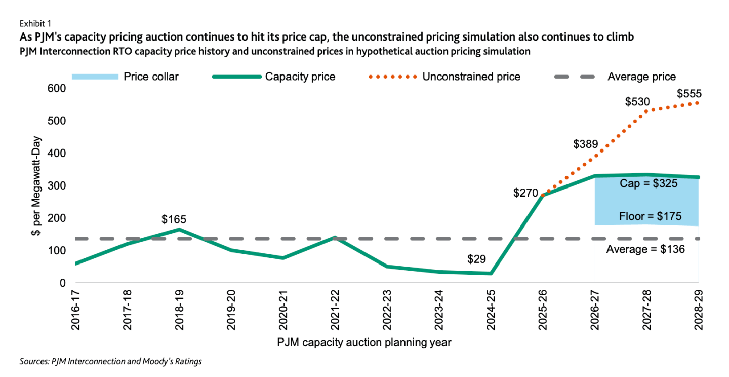
The attached graphic — a snapshot of an animated GIF created by Techpinions’ Ben Bajarin — is a work in progress. But having seen it, even in this rough form, I can’t forget it.
It’s a picture of the modern computing era drawn using an app called Perspective that allows raw data to be revealed one frame at a time, like a motion picture. The data in this case are market shares of computing platforms shipped each year from 1977 to 2014.
The Perspective version tells a story with which I’m quite familiar; the years represented correspond pretty closely to my career in journalism, most of it covering tech.
On the left side we have the rough and tumble days of the TRS-80 and Apple II (green), Atari 400/800 (purple), Commodore 64 (red), etc.
On the right we have the rough and tumble days of Nokias (green), BlackBerries (red) iPhones (yellow), Android phones (red) and tablets of various flavors.
In the middle we have a period of consolidation with the PC (blue) dominating the computing landscape for more than 20 years before dwindling into what looks, to me, like a tea spout.
In Perspective the data have the beauty of an abstract painting. To see the thing in action — and watch Bajarin polish it — you need a Techpinions subscription. (At $10 per month or $100 a year, a good value.)
Note, however, that the graph tells only part of the story. By constraining itself to market shares, Bajarin’s graphic doesn’t even try to convey the explosive growth in the number of computer devices sold since the Apple II and Trash-80.
UPDATE: The finished narrative is available without a subscription via the Perspective app (free on iTunes).
Below: A snapshot of the final version. Click to enlarge.

Follow Philip Elmer-DeWitt on Twitter at @philiped. Read his Apple AAPL coverage at fortune.com/ped or subscribe via his RSS feed.