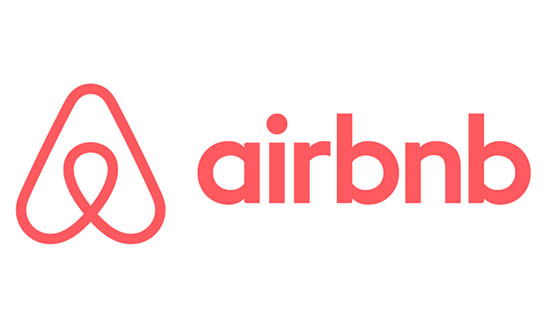
Vacation rental service Airbnb unveiled a new logo last week that generated a wave of criticism for its design. Some likened it to a triangular paperclip or, even more crudely, to certain female anatomy. But the company still stands by the logo, which it calls Bélo and says represents belonging. “It’s a symbol for people who want to welcome into their home new experiences, new cultures, and new conversations,” Airbnb said on its blog. Well, maybe if you squint.
As to be expected, branding experts aren’t exactly thrilled by the design. Their verdict: Why futz with something that seemed to work just fine.
“My issue is that the original logo was pretty good to begin with,” said Rick Barrack, chief creative officer at CBX, a brand agency.
Airbnb’s prior logo – the company’s name in light blue lettering – was simple and something that more start-ups should do, he said. It communicated the brand and stuck in the mind of its users. Despite backlash, Barrack said that Airbnb should now stay the course. “The outrage will go away very quickly,” he predicted.
Against the backdrop of Airbnb’s logo Fortune is exploring other examples of corporate branding that – at least according to popular opinion – missed the mark. Here are a few examples.
Tropicana
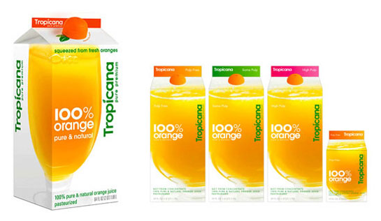
Date released: 2009
Lifespan: Nearly two months
The Pepsico-owned juices (PEP), which claims to deliver "100% pure squeezed Florida sunshine" to its customers, had somewhat of a cloudy day branding-wise five years ago when it introduced new packaging. The company replaced its iconic logo - an orange-with-a-straw-stuck-in-it - in favor of a glass filled with juice. The backlash was fierce: Sales by Tropicana rivals increased, while its own fell 20%, according to AdvertisingAge. A little over a month later, it switched back to its previous design.
Gap
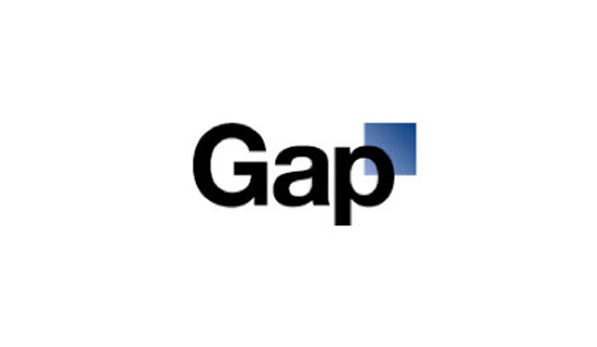
Date released: 2010
Lifespan: A week
Clothing store Gap (GPS) tried to recast its image from "classic, American design to modern, sexy, cool," a company spokesperson said at the time. That ended in failure, however. The retail store has always been known for the elegant and elongated letters of its font. But it switched to lowercase black letters with an awkwardly placed blue box atop the letter.
In reaction to the outcry, the company used Facebook to solicit its customers for advice. "We know this logo created a lot of buzz and we’re thrilled to see passionate debates unfolding!” the company wrote. "So much so we’re asking you to share your designs. We love our version, but we’d like to see other ideas." The call for help didn't amount to much and the company later returned to its "classic" roots.
JCPenney
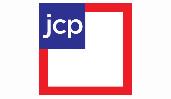
Date released: 2012
Lifespan: A year
For JCPenney (JCP), the logo woes were many. In fact, the company switched up its design every year for four years. In 2011, it threw out its classic logo for another featuring lower case letters and a red box. It then held a competition for a new design. The winner? A lowercase "jcp" in a blue box, bordered by a bigger red box. The tweak didn't make customers happy, however, and they changed the design back a year later (having also changed the logo a year before that in 2011). Of course, all these redesigns came as the company stumbled financially, capped by a $550 million loss in the fourth quarter of 2012.
Starbucks
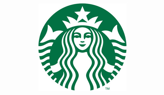
Date released: 2011
Lifetime: Still alive
Starbucks (SBUX) switched its logo to something simpler to celebrate its 40th anniversary. The company added a lot of green to the design and removed the "Starbucks Coffee" phrase that had wrapped around the company's signature symbol - a siren. CEO Howard Kurtz said that the mascot had "been through it all" over the last four decades, and needed a "small but meaningful update." Reactions were initially mixed, although the criticism has since died down.