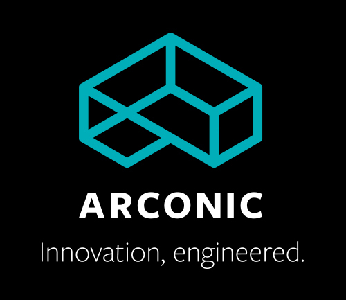
Metals and manufacturing giant Alcoa (AA) has revealed the name, logo, and tagline of its soon-to-be spinoff company: Arconic. The new firm will focus on manufacturing multi-alloys for the aerospace and auto industries.
The decision to split the company in two came in the fall as a response to Alcoa’s consistently slipping share price. The company’s primary business had been taking a years-long beating as aluminum prices have fallen, hurt by an influx of cheap metals sourced from China.
Get Data Sheet, Fortune’s daily tech newsletter
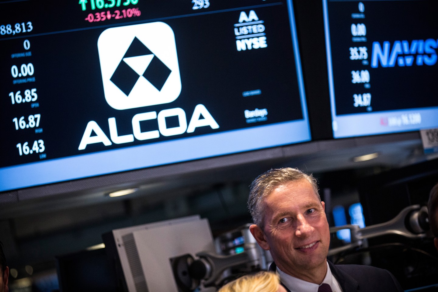
Klaus Kleinfeld, chairman and chief executive at Alcoa, is banking on the breakup unlocking value as the separated business will no longer be subject to the vicissitudes of the commodities markets. He plans to step down from is role at Alcoa and join as the head of Arconic.
“The ‘Arconic’ brand fuses our extraordinary heritage with our highly promising future,” said Kleinfeld in a statement. “It echoes our 127-year history of invention – and reinvention.”
For more on Alcoa’s split, watch:
Explaining the company’s branding in a release, the company gave three reasons for the selected name. First, the “A” recalls its progenitor, Alcoa. The “Arc,” the company said, signifies the “arc of progress.” And third, the “-conic” connotes the firm’s “iconic” products.
Arconic’s logo looks like a distorted, teal Necker cube. It bears a slight resemblance to Alcoa’s trademark A-like symbol. “The logo is a two-dimensional icon that the eye sees as a three-dimensional projection, symbolizing Arconic’s ambition and ability to make what is often deemed impossible real,” the company said of the structure.
The company also slightly redesigned Alcoa’s logo, giving it a subtle facelift. The original box that housed the “A” symbol is gone, and the blue-and-white colors are inverted.
Read more: “Here’s Why 3D Printing Needs More Metal”
Andrew Lane, a Morningstar analyst, told the Wall Street Journal that he “had concerns about how fast [Arconic] can improve profit margins after a ‘relatively flat fourth quarter'” at Alcoa.
The company said the breakup “remains on track” for the second half of the year.


